
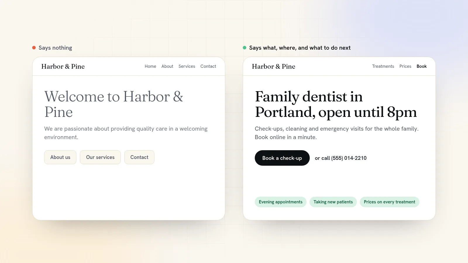
A homepage that gets people to book or buy answers three questions in the first screen: what you do, who it's for or where, and what to do next. Below that, it backs the promise up with proof, answers the questions that stop people from booking, and repeats the same button. Write it in the words your customers use, give it one main action, and check it on a phone before anything else.
Here's how to write each part, with examples you can borrow, and the mistakes that make a good business look forgettable.
The first screen: what you do, where, and what to do next
The first screen, the part people see without scrolling, is the only part of your homepage every visitor sees. It has three jobs:
- A headline that says what you do and for whom, in under about ten words.
- A line underneath that adds the specifics: where, how, or why you rather than the next result.
- One main button that says exactly what happens when it's tapped, plus a quieter second option for people who aren't ready.
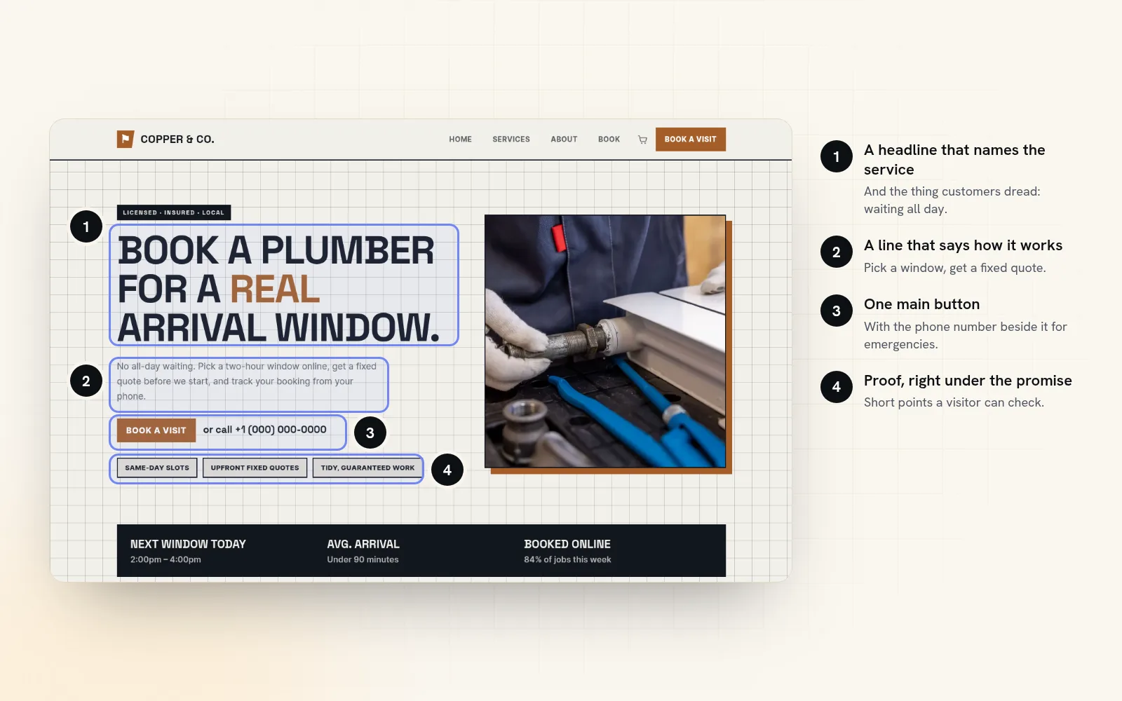
Look at the plumber example above. The headline, "Book a plumber for a real arrival window", names the service and the thing customers hate most about plumbers: waiting all day. The line underneath explains how it works. The button says "Book a visit", and the phone number sits right next to it for the person with water on the floor.
Write the headline five ways, then pick the clearest
Your first idea is rarely your best. Write at least five headlines from different angles, then choose the one a stranger would understand fastest. For a family dental practice:
- The outcome: "A dentist your kids won't dread"
- The problem: "Toothache? Same-day appointments in Portland"
- The audience: "Family dentistry for busy parents in Portland"
- The contrast: "Evening appointments, so nobody misses school or work"
- The specific detail: "Open until 8pm, Monday to Thursday"
Choose clear over clever. If the headline needs the line underneath to make sense, rewrite it. And skip the classics that say nothing: "Welcome to our website", "Quality you can trust", "Your one-stop shop".
Pick one main action and name it properly
Decide the single most valuable thing a visitor can do: book, order, call, request a quote. That's your main button, in your boldest colour, at the top and again at the bottom. Everything else is a quieter link.
Button text should start with a verb and say what happens next:
| Instead of | Write |
|---|---|
| Submit | Get my quote |
| Learn more | See prices |
| Click here | Book a table |
| Contact us | Call (555) 014-2210 |
| Shop | Order for Saturday pickup |
On a phone, make the phone number a link that dials when tapped. For many local businesses, that tap is the conversion.
Show proof right under the promise
Anyone can claim to be the best plumber in town. Proof is what makes a visitor believe you. Put it directly under the first screen, not on a separate page:
- Reviews with real names, ideally ones that mention a specific thing ("came within the window they promised").
- Photos of your actual work: the room you renovated, the cake you made, the haircut you gave.
- Facts you can back up: licensed and insured, years in business, the town you've served since 2009.
- Faces. A photo of the owner or the team beats any stock image.
Never invent a number or a review. One true, specific detail does more than three vague boasts.
Answer the questions that stop people from booking
Every visitor arrives with doubts. Name them and answer them on the homepage:
- "How much will it cost?" Show prices or "from" prices for your main services. A price puts off the people who'd never pay it and reassures the ones who would.
- "Do you cover my area / are you open when I'm free?" Hours, service area and location, visible without hunting.
- "What happens after I book?" Three short steps: book, we confirm, we turn up.
- "What if something goes wrong?" Your cancellation policy, guarantee or refund terms, stated plainly.
The questions you answer on the phone every week are the ones your homepage should answer first. The rest of the site has its own list; our small business website checklist covers it.
An order that works for most small business homepages
- First screen: headline, the line underneath, main button.
- Proof strip: a review, a fact, a few photos of your work.
- What you offer: three to six services or products, each with a price and a link.
- How it works: three steps, if there really are three.
- Who you are: a photo and two sentences about the people behind it.
- More reviews.
- Common questions: four to six, short answers.
- Closing call to action: the main button again, with hours, address or service area beside it.
Adjust it to your trade. A restaurant moves the menu up; a contractor might lead with photos of finished jobs. But keep the first and the last section: promise plus button at the top, button plus practical details at the bottom. For a worked example in one trade, see how to make a website for your salon.
Write like you talk to a customer at the counter
Read your homepage aloud. If you wouldn't say a sentence to someone standing in your shop, rewrite it.
| Sounds like a brochure | Sounds like you |
|---|---|
| We are passionate about delivering exceptional culinary experiences. | We cook a short menu that changes with what the market has that week. |
| Our team of highly skilled professionals is committed to your satisfaction. | You'll get the same stylist every visit, if you'd like. |
| We offer a comprehensive range of plumbing solutions. | Leaks, boilers, blocked drains, new bathrooms. Fixed price before we start. |
A few habits help: write "you" more than "we", use the words customers use (they search "blocked drain", not "drainage solutions"), and cut any sentence that could appear unchanged on a competitor's site.
Check it on a phone before anything else
Open the homepage on your phone and look at the first screen only. Can you see the headline and the main button without scrolling? Does the headline still make sense when it wraps onto four lines? Is the button big enough for a thumb?
Then try the five-second test. Show the page to someone who doesn't know your business for five seconds, take the phone away, and ask what you do and what they'd tap. If they can't say, the first screen needs work.
Start from a homepage that's already laid out
Writing is easier when the structure is done. Every Quick Elements template comes with a homepage laid out for its trade, with a headline and main button in the first screen and a closing call to action at the bottom. The booking pages already use your trade's words, so a salon takes appointments, a gym fills places in classes, and only a venue sells tickets. You replace the words and photos with your own instead of starting from a blank page. Browse the templates and pick the one closest to your business.
When you're stuck on a line, the AI assistant on every Quick Elements site can help. Ask it for "five headline options for a family plumber in Leeds" or "rewrite this section in plainer words", and it edits the page in front of you. Nothing goes live until you save, so you can try ideas freely and keep the one that reads best.
Choose a plan, pick a design, and you'll be editing your own homepage, with a booking button that actually takes bookings, the same day.